Pendo
Pendo is a SaaS company with a simple pitch — it’s software that makes your software better. Using a combination of analytics, in-app guides, and feedback tools, organizations can understand how their users are moving through their software and use different features to improve customer experience. Tasked with creating a new website, I worked with a team from agency Cake and Arrow as content strategy lead and writer.
Project Snapshot
We kicked off the project by getting a detailed understanding of the business, website, and customers through a series of workshops and one-on-one interviews. As their goals and struggles emerged, the larger challenge began to come into focus.
In short, the site was patchwork. Web pages had been thrown up to keep pace with acquisitions and product launches creating a scattered that lacked cohesive messaging and user flow.
Our job? Organize it into an ecosystem built to convert.
Project objectives
Speak to both of their audiences
Pendo’s original product was built customer-facing software. They recently launched a version for employee-facing software, meaning our messaging needed to speak to all.
Keep the Pendo feel
Pendo prides themselves on not looking or sounding like a typical tech company. We needed to amplify this voice.
Focus on boosting conversion
At the end of the day, the site needed to be generating more leads. We needed to focus improving the conversion funnel and making the site work harder for us.
Audience segmenting
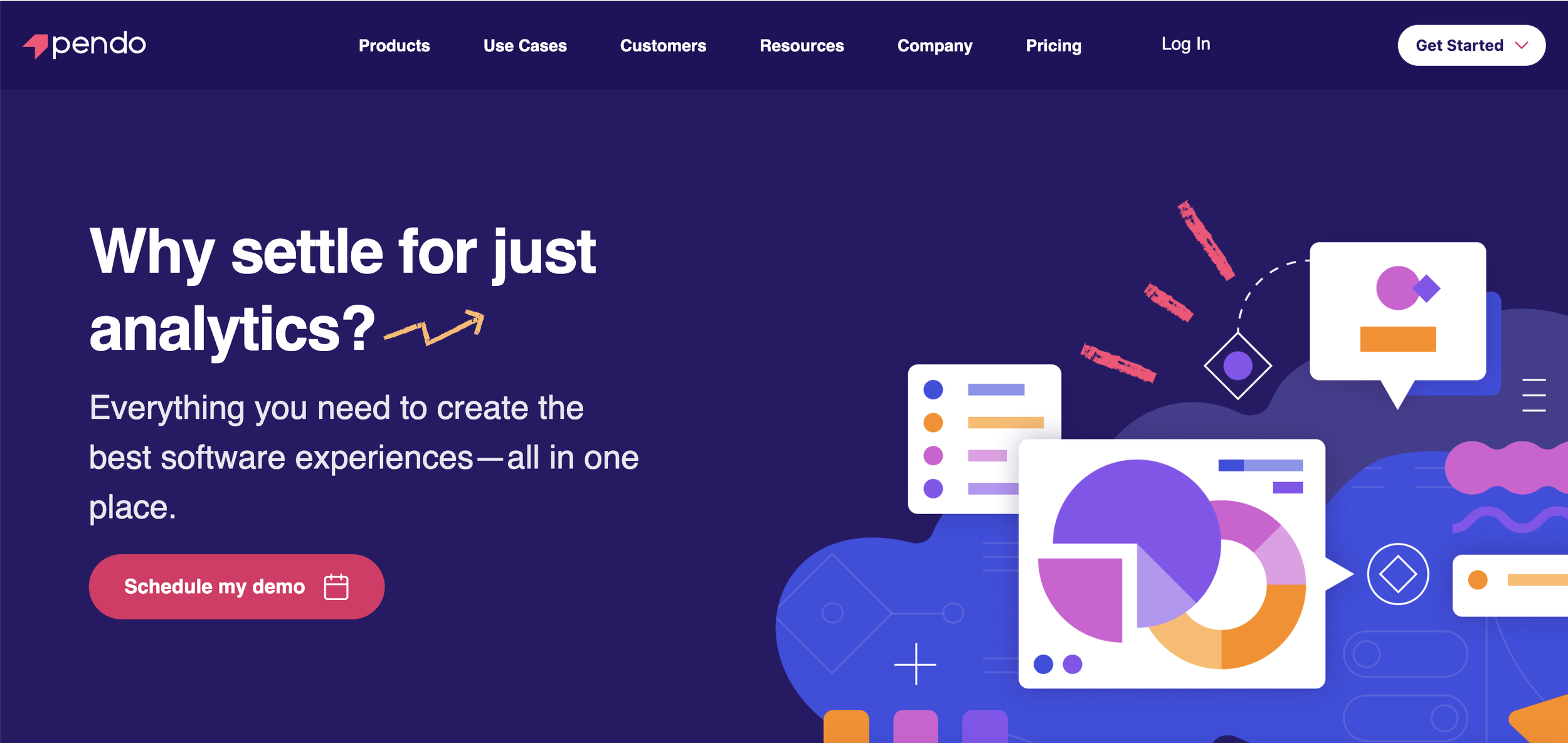
We tackled the audience challenge by getting rid of internal naming conventions and instead using clear language that stated who each product served. This paired with a toggle switch made it easy let both products live on every page.
Less techie. More human.
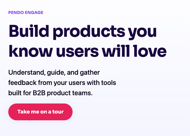
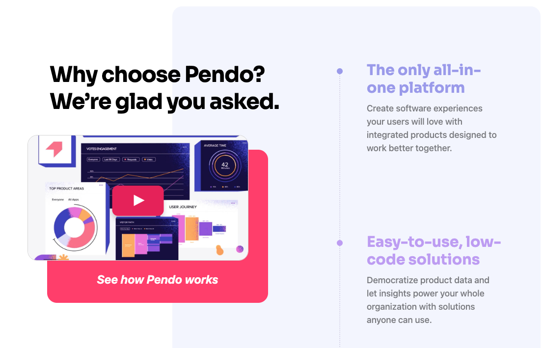
In line with the Pendo brand feel, I rewrote key product messages and copy across the site to be more approachable. Rather than lofty promises or hyper-detailed features, I steered messages towards simple language that laid out the benefits people get from their products.
Sealing the deal
Conversion defines site success. We started with CTA’s — making sure they were on the right pages, easy to find, and that the text told the user what came next. After the intial click, we simplified the experience using forms to make inputting information simple while providing the sales team with more firepower to bring to the first call.